Monday, 13 May 2013
Sunday, 5 May 2013
EXP2 FINAL SUBMISSION: THE SPACE BETWEEN
Links
Initial monuments - 12 Axonometrics
Electroliquid Aggregation - 6 Axonometrics
Light to Dark - 36 Textures
Sketchup Model
CryEngine Level
Light to Dark - 36 Textures
Sketchup Model
CryEngine Level
In this experiment we were tasked to create a monumental architecture based on architectural concepts relating to Frank Lloyd Wright and Aires Mateus Architects, as well as design the landscape surrounding it. My aim was to bring their two differing architectural styles together in a way that would create a dynamic monument with great contrast between forms.
To direct my design, I took two concepts we settled on in class - "Voids and negative spaces articulate a sense of secrecy", and "Artificial cultivation of the environment" - and combined them together in an ElectroLiquid aggregation that helped define my final monument - "An almalgamation of voids and negative spaces that artificially cultivate the environment to create a sense of secrecy in the landscape."
Applied textures
5 Images
 |
| The stairs are constructed in a way that they fold over themselves - the landings don't take you around and then up, instead cutting the stairs in half and going back in the other direction. |
 |
| This area is a true negative space - It is a space meant only for you to move through as you make your way to the meeting point and the next part of the monument. |
 |
Wednesday, 1 May 2013
EXP2 Week 3: Progress
Landscape
Over the past few days I have put a lot of thought into what I think the landscape for my CryEngine model will look like and how it will enhance or complement (or challenge) my monument.
Original Concept
After discussing this concept with Matt we agreed that having mountains towering over the monument would dilute the monumentality of it, and that this monument needs to be in a place where it dominates the landscape before it.
Revised Concept
We settled on the idea of the monument overhanging a cliff face, an idea I experimented with earlier on. In this landscape the monument dominates all, as the land before it drops completely into the endless abyss of the ocean. Relating back to my main intention of the monument I modified the design, exaggerating the horizontality and verticality of the monument to accentuate the stark drop of the cliff face into the sea.
 |
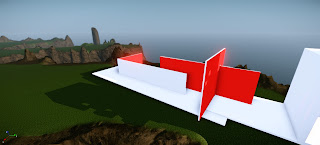
| The portion of the monument at and over the cliff's edge. |
Current stage of Monument
Settling on the cliff location, the work on my monument has progressed quite nicely.
The stacking of 'blocks' right at the edge of the cliff face accentuates the verticality of the cliff face and adds to a sense of weight and inertia with the monument, which contrast heavily with the thin, planar elements leading up to the cliff's edge.
This synthesis of light and dense, the contrast between horizontality and verticality reflect on the differing views Mateus and Wright had towards architecture.
 |
| This monumental checkerboard window/screen was inspired by the windows in Aires Mateus' project, Nursing Home. |
Subscribe to:
Comments (Atom)


