Saturday, 29 June 2013

EXP3 - Bridge - The Final Submission

MashUp and First Draft CryEngine 3 Environment
Second Draft CryEngine 3 Environment

In this experiment we were given the brief to design a school of architecture that forms a bridge, spanning a valley from our country of origin. I was my own client, acting as the Dean of Architecture for this school which brought some interesting challenges along the way.


Video of Bridge and Elevators


Links to CryEngine Environment and Sketchup models


Sketchup Folly


Friday, 28 June 2013

EXP3 - Update - Elevators

Here's the flowgraph for the Dean's elevator down into the folly.
 Both of my elevators use similar animations.


Thursday, 27 June 2013

EXP3 - 36 Textures


EXP3 - Circulation and Progress

Circulation

Circulation around the school of architecture is complete. Because of the multitude of levels of varying heights and thicknesses in my design, I had to organise the spaces and the circulation between them in a way that made sense and was easy to navigate for students and staff, as well as fulfil it's function as a bridge and allow passage from one side to the other. Because this bridge connects two places at different altitudes this involved a number of stairs.


I have yet to add side walls as well as surface thickness to elements such as the glass panels,which will be added as I detail the bridge. To make sure everything was working I imported my bridge into CryEngine.

My bridge in CryEngine in it's current form.

The main entrance for students. To accommodate for  heavy traffic between classes I  made the grand stair  very wide and included two sets of stairs to allow students to easily move between spaces.

My completed elevator for students. It may not look like much now but wait until you see it in action.


Mirrored stairs leading up to the lecture theatre.


The academic area.
The studio spaces. The waviness in the underside of the stairs is unintentional. It's supposed to be flat but because each step is a component CryEngine renders it weirdly and you end up with this result.

The dual stairwells running through the core of the building. I like to think of it as the "artery" because  it  is crucial to the function of this structure as both a bridge and a school of architecture.

 Progress

My elevators are completed, the folly is designed and just needs detailing, and the bridge needs to be detailed. Everything is going along nicely.

Monday, 24 June 2013

EXP 3 - Week 7 Update - Redo of CryEngine Valley

Unhappy with the quality of my valley in CryEngine, I decided to rebuild my CryEngine valley from scratch  using not one but two completely different locations from my country of origin Sri Lanka, the ancient rock fortress Sigiriya and Little Adam's Peak.
Sigiriya
Little Adam's Peak
My new valley is going to be an amalgamation of these two geographically distant landforms into a composite valley based on them. Because of the differing heights between the two  landforms the bridge allows a passage from the top of one to the other.
New CryEngine Valley


In-progress bridge for scale.


Wednesday, 12 June 2013

EXP3 - Week 5 Update - Circulation

After having my critique with my tutor last week we decided on scrapping all of my revisions in the design and sticking to my first design based on the brick country house and keeping the essence of Mies Van der Rohe's work intact. The idea is to have this structure cutting into the valley with the long, protruding walls coming out of each side, which also give it support.. This allows me to be flexible in the size and length of the bridge as I can extend these parts and still maintain the structural integrity of the bridge as a whole.


I developed the section in sketchup into a 3 dimensional model and began to work on the distribution of spaces and the circulations between them.

I imagine the layout of my school of architecture to be clusters of spaces, namely public spaces, spaces for staff and spaces for students, and there to be overlap when these types of spaces intersect. I thus constructed a Venn diagram to visualise this layout. From here I detailed where each space was going to go and moved on to circulation and refining the level of detail in my  model.


My school or architecture has a great number of different levels in it so it is really important to have proper, efficient circulation between spaces. Focusing on the staff wing, I brainstormed ideas of how to connect these spaces. It became immediately apparent that the only way to connect these spaces was through a network of stairs and elevators.

In the above image you can see how the academic staff and the Dean converge on the meeting space, allowing them to have discussions and interact fairly easily. The Dean also has a generously large office with a panoramic view. 
(Currently I'm working  with the side walls removed for easy editing.)
The Dean's Office (top) and the current circulation between spaces.
For the design of the offices of the Head Staff I drew inspiration from the modular, cubic office designs found in the Macquarie Bank Building in Sydney.
Interior of the Macquarie Bank Building.

Offices for the head staff.
This dynamic, modular design where the office spaces are cantilevered off the supporting wall give the head staff unique and interesting perspectives while remaining as smaller spaces compared to the Dean's office.


Monday, 3 June 2013

EXP3 - Two-point perspectives


EXP3 - Developing my bridge

To develop my bridge I first used an existing plan as a precedent for the section of my final design. I decision to use the plan for the Brick Country House by Mies Van Der Rohe was influenced by my architectural theory about new and upcoming technologies being the gateway to a new era of architecture, which I see being reflected in the interesting orthogonal geometries drawn out in the plan. After selecting this plan I began experimenting.

Brick Country House by Mies Van der Rohe
In this process I utilised tracing paper to a great extent in order to manipulate the plan and help me brainstorm ideas.


I began by using tracing paper to trace the thick, heavy walls in the Country House and then rotated and overlaid the trace onto the plan, resulting in the above abstract bridge design. I'm drawn to the rotational symmetry of the above design as it naturally allows for spaces for students, teachers and combined spaces for both.


I then traced over the entire section and began imagining where the various rooms would be located. At this stage I decided to keep my design relatively rigid to the original floor plan, in order to have a grounded platform which I can extrapolate and experiment from.


Still keeping to the original plan, I looked at how this design would look in a more bridge-like form. I played with the idea of an abstracted cable-stayed bridge, a school of architecture suspended in the air by mere strings.


From here I began manipulating the design, stretching and elongating it to be more bridge-like. At this point I realised the modular, mis-matched blocky shaped don't really look that integrated into the bridge.


From here I started streamlining the design which helped it to integrate better into the bridge. While I see this as an improvement, I realised that I lost the rotational symmetry aspect of the design.


I streamlined even further here, largely moving away from orthogonality and going towards a sleeker, more angular design. I feel this better represents rotational symmetry and the angles abstractly represent circuitry and the transfer of information.

Settling on this design I drew a section of it in sketchup.


From here I extruded it into three dimensions and added the cables.


I settled on this design because it's angular nature and symmetric qualities allow for vastly different views of the valley depending on where you are. On the upper levels you would see the surrounding mountain ranges and the sky whereas on the lower levels you would see the bottom of the valley, the river, and the underside of the bridge, showing you what little there is preventing you from plummeting to the ground.

Over the next few weeks I will detail the rooms of the school and further refine my design.

Sunday, 5 May 2013

EXP2 FINAL SUBMISSION: THE SPACE BETWEEN

Links

Initial monuments - 12 Axonometrics
Electroliquid Aggregation - 6 Axonometrics
Light to Dark - 36 Textures
Sketchup Model
CryEngine Level


In this experiment we were tasked to create a monumental architecture based on architectural concepts relating to Frank Lloyd Wright and Aires Mateus Architects, as well as design the landscape surrounding it. My aim was to bring their two differing architectural styles together in a way that would create a dynamic monument with great contrast between forms.

To direct my design, I took two concepts we settled on in class - "Voids and negative spaces articulate a sense of secrecy", and "Artificial cultivation of the environment" - and combined them together in an ElectroLiquid aggregation that helped define my final monument - "An almalgamation of voids and negative spaces that artificially cultivate the environment to create a sense of secrecy in the landscape."

Applied textures


5 Images


The stairs are constructed in a way that they fold over themselves - the landings don't take you around and then up, instead cutting the stairs in half and going back in the other direction.

This area is a true negative space - It is a space meant only for you to move through as you make your way to the meeting point and the next part of the monument.


The public lookout point. The colossal detailing is inspired by Aires Mateus' previous work. The private lookout point above cuts out views of the surrounding cliffs and mountainside due to sheer height, providing secrecy in the landscape.

EXP2: Light to Dark - 36 Textures


Wednesday, 1 May 2013

EXP2 Week 3: Progress

Landscape

Over the past few days I have put a lot of thought into what I think the landscape for my CryEngine model will look like and how it will enhance or complement (or challenge) my monument.

Original Concept


The main intention with my monument was to have it mimic and/or accentuate certain features of the landscape while still being alien to it. Drawing from the general shape of my monument I decided to have it perched on the edge of a deep valley, overlooking a river and a vast mountain range that encompassed the whole of the clients view.

After discussing this concept with Matt we agreed that having mountains towering over the monument would dilute the monumentality of it, and that this monument needs to be in a place where it dominates the landscape before it.


Revised Concept

We settled on the idea of the monument overhanging a cliff face, an idea I experimented with earlier on. In this landscape the monument dominates all, as the land before it drops completely into the endless abyss of the ocean. Relating back to my main intention of the monument I modified the design, exaggerating the horizontality and verticality of the monument to accentuate the stark drop of the cliff face into the sea.
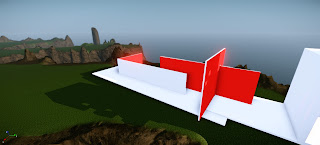
The portion of the monument at and over the cliff's edge.
 I built the environment around the cliff concept and continued to develop it to a high resolution.


 Current stage of Monument

Settling on the cliff location, the work on my monument has progressed quite nicely.

The stacking of 'blocks' right at the edge of the cliff face accentuates the verticality of the cliff face and adds to a sense of weight and inertia with the monument, which contrast heavily with the thin, planar elements leading up to the cliff's edge. 
This synthesis of light and dense, the contrast between horizontality and verticality reflect on the differing views Mateus and Wright had towards architecture.
This monumental checkerboard window/screen was inspired by the windows in Aires Mateus' project, Nursing Home.

 Over the next day or so I aim to add the micro features including stairs, as well as further develop the landscape.